SOCIAL MEDIA VISUAL SYSTEM
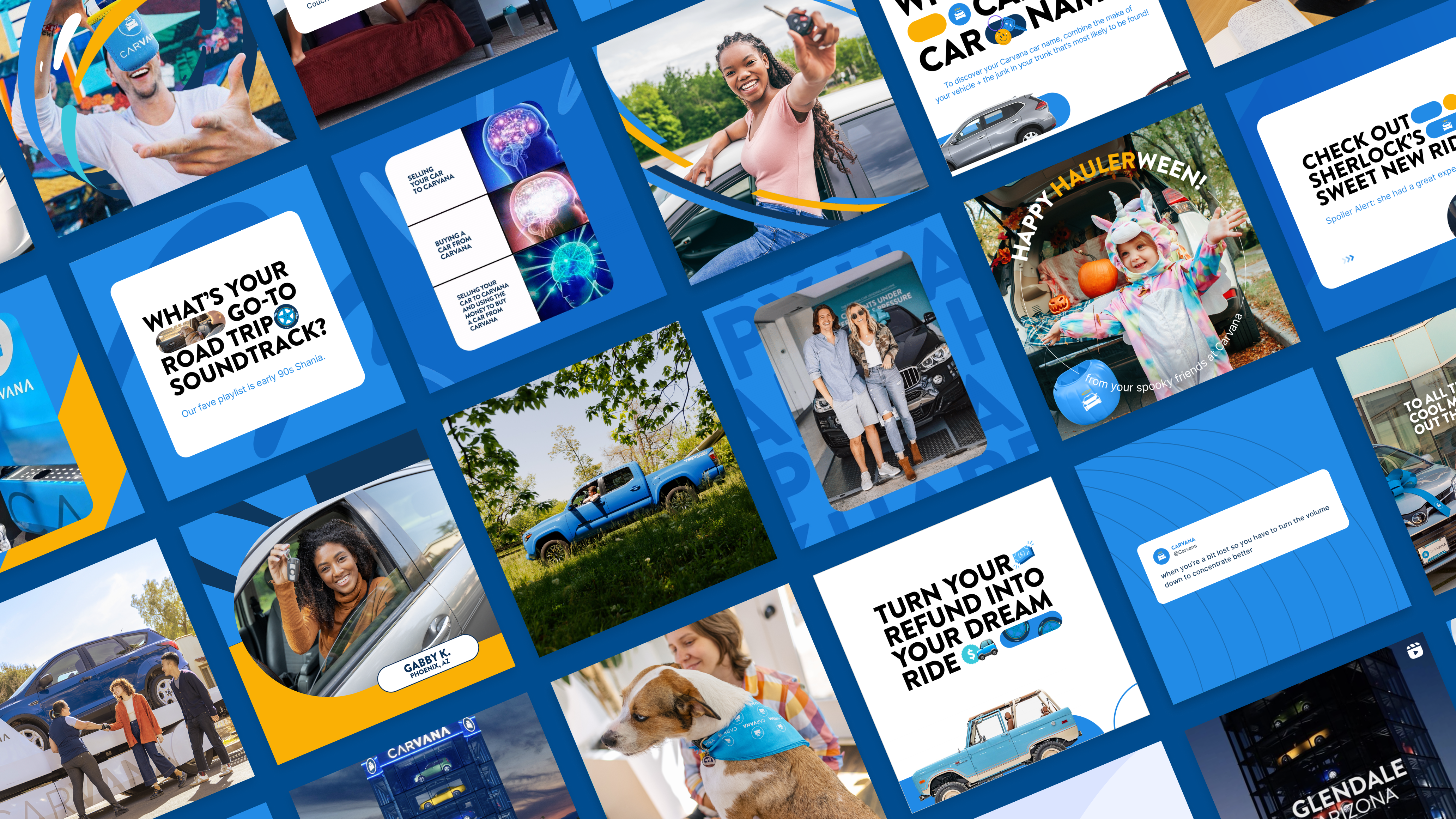
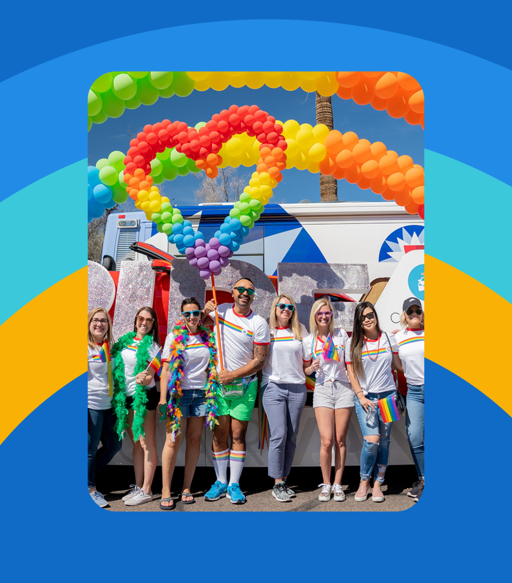
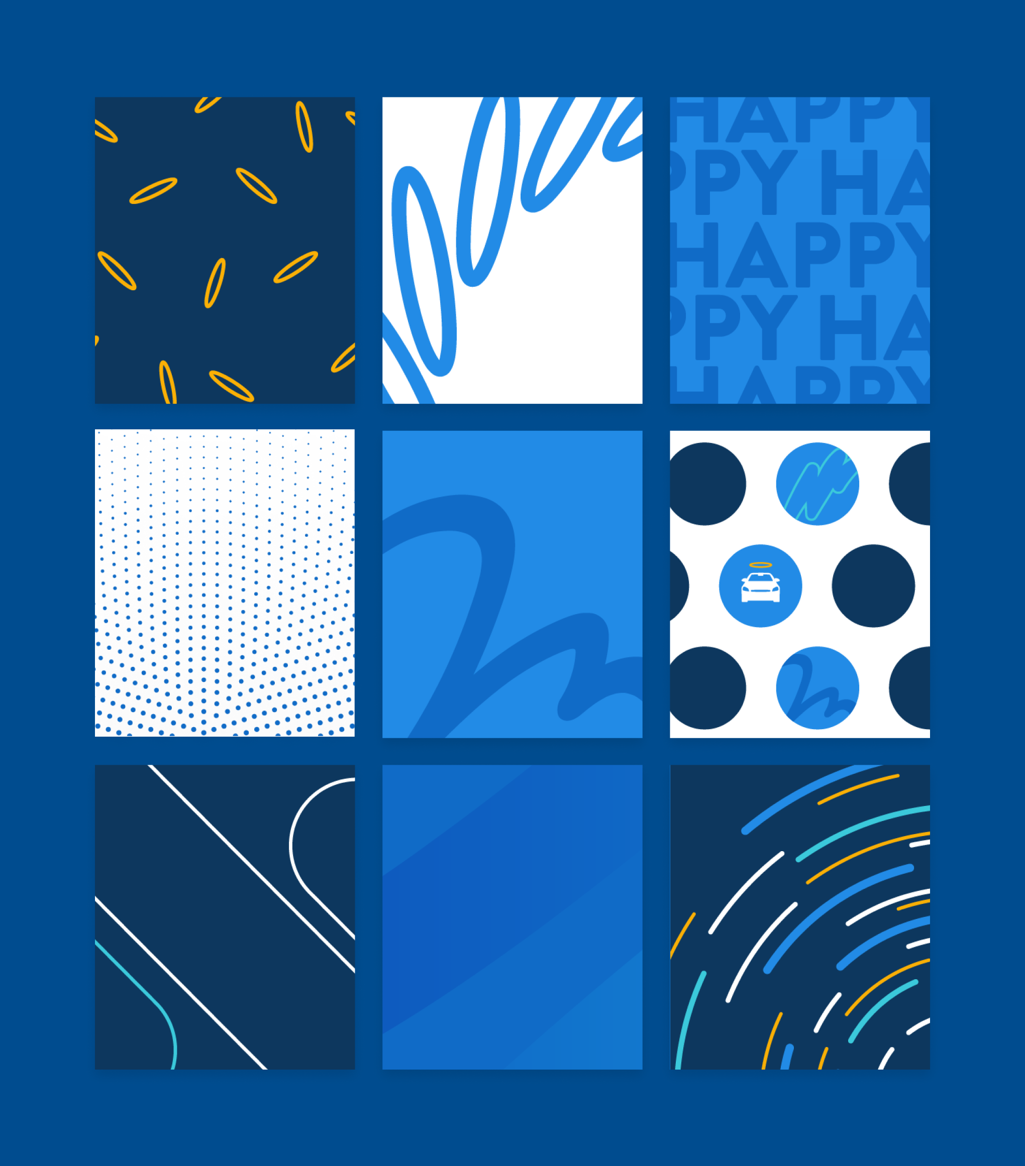
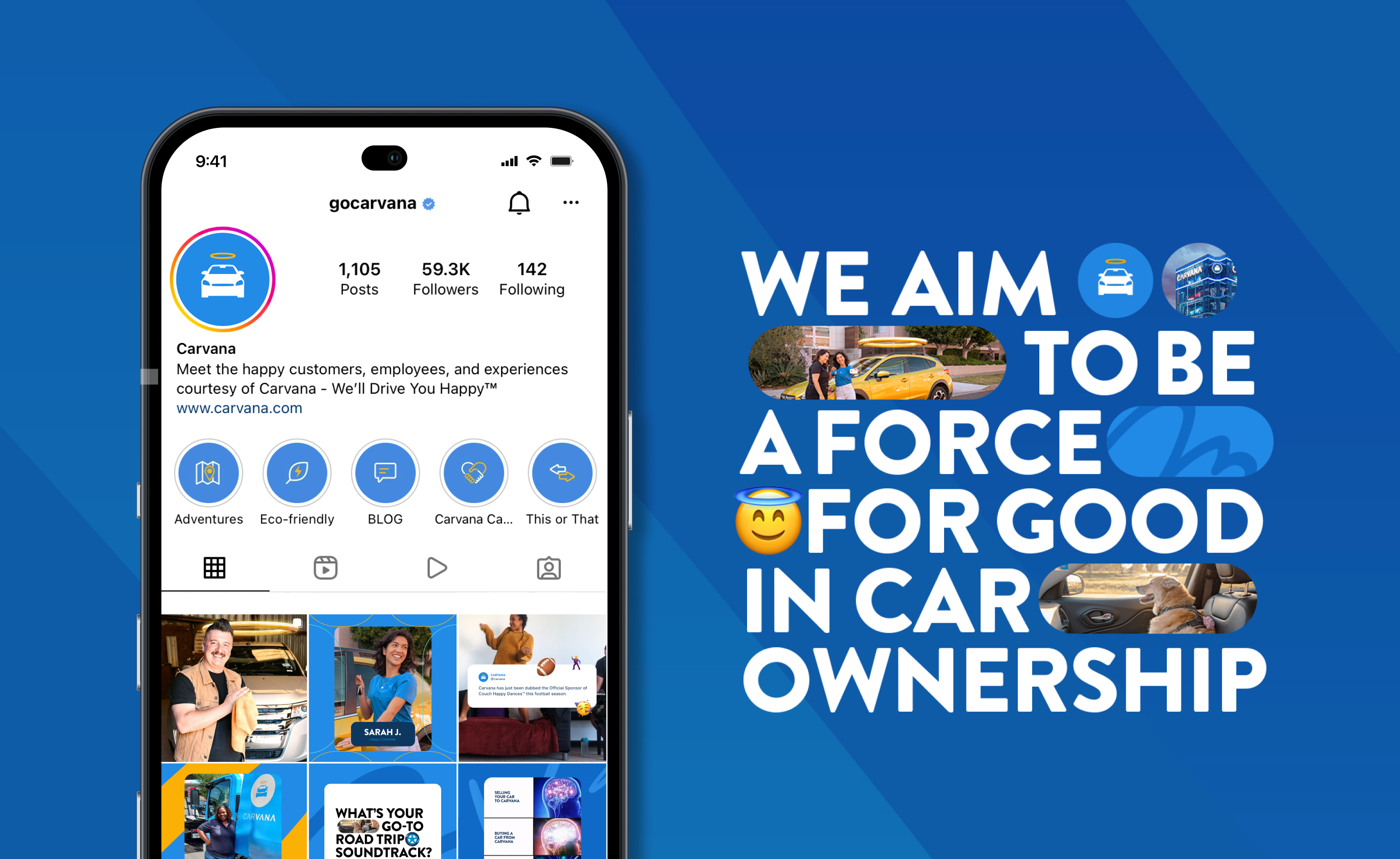
Everything Carvana does revolves around happiness. From providing customers with a positive car buying experience, to employee events, to spreading joy in our communities. How can we become a beacon of feel-good energy on social? Our visual approach aims to combine playful patterns, big happy smiley photography, and meaningful storytelling to help accomplish that while framing our halo as the umbrella of happiness.
PROJECT TYPE
Visual identity
TEAM
Visual design
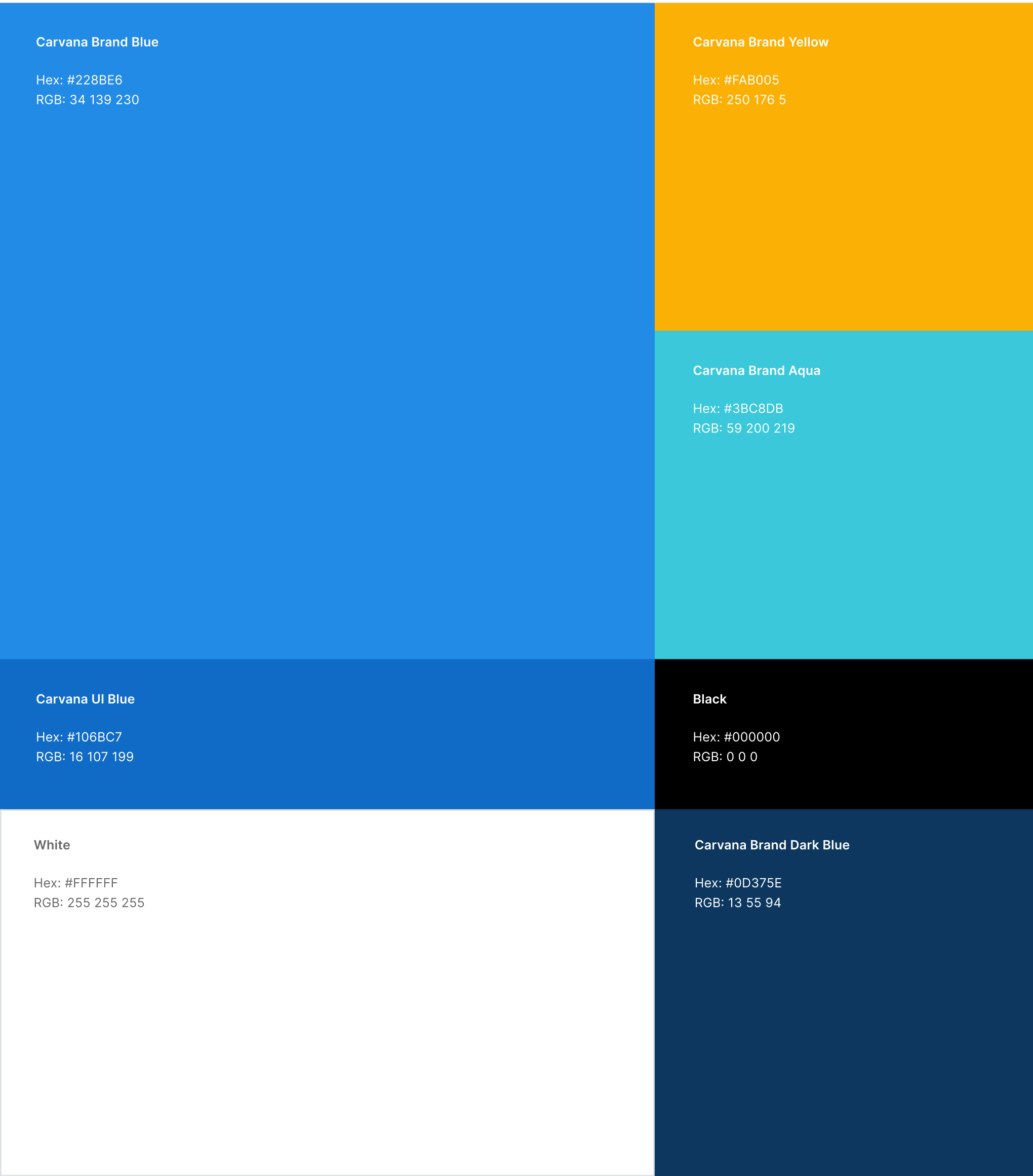
Color is a powerful means of recognition, helping fortify a clear identity for Carvana and our products, while also highly emblematic of Carvana’s spirit of excitement.
For our color approach, we continued the use of Carvana Blue as a distinctive brand asset. In addition, we introduced Carvana Aqua to bring the colors into a more digital-first space.
Carvana Aqua provides a youthful punch of energy into our work and helps differentiate us from brands with similar blue/yellow palettes.
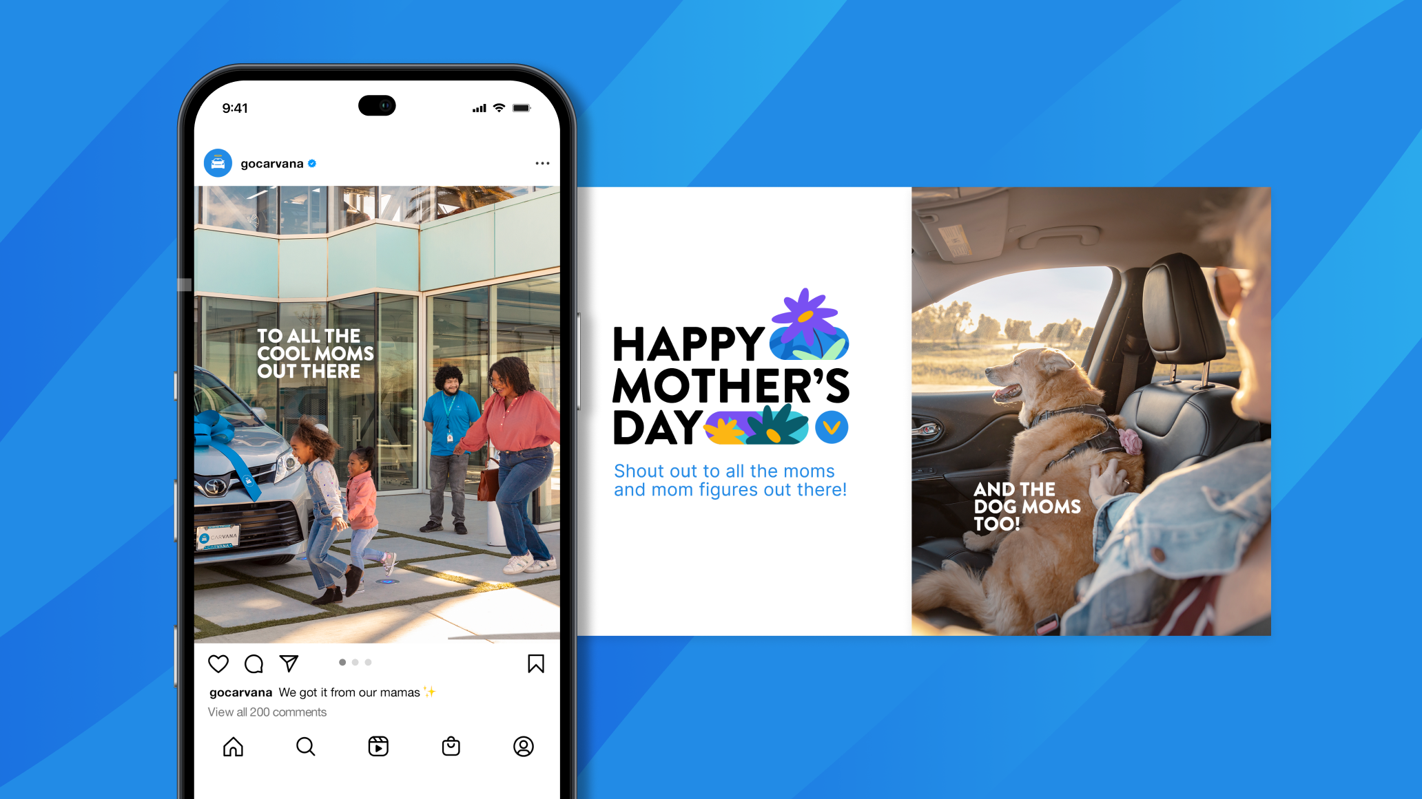
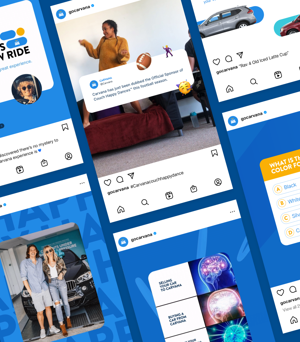
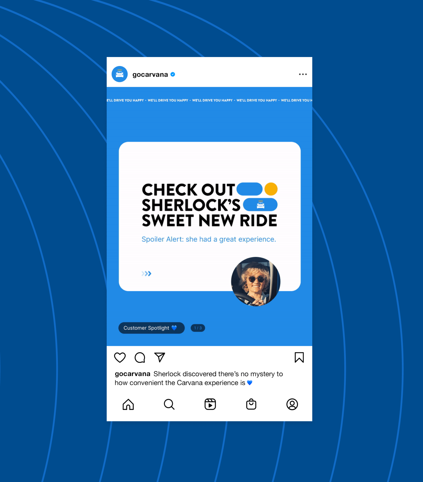
We’re introducing a new type treatment using our signature Brandon font, new patterns, and extended use of emoji. Using brand elements like illustrations, shapes, images interacting with each other in the post help bring the image to life.
Los Angeles 🌴 + Phoenix 🏜
Carvana © 2024
